Had a tutorial and my teacher thought about either a concertina or like a series of postcards that had different images
Can foiling be done in any font also? So like hand writing kinda italics"
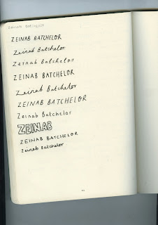
I asked 10 people which type they preferred and which sat best. 1, 2 & 3 was the most popular. It was the most legible and delicate, therefore took these 3 forward and developed them more.
Zeinab's feedback -
Leaving the idea of handwriting I then began to search for a range of display fonts online -
"I really like the last one, but not keen on the z as it looks like a 3"
Both of us still wasn't sure of this font, so carried on looking. Then Zeinab suggested a font called Bakery and a font called may wilde -
Postcard layouts -
1
2
3
4
When discussing layout with Zeinab we both agreed that number 3 has the best layout, this is because there is enough spacing between the type, and gives a clean and minimal layout.
The body text is Baskerville this is used as Zeinab asked for a serif font to give it a more personal design, its also legible and because of its style it sits well with the calligraphy used on the name.
Foiling Experiments
Zeinab wasn't sure on a specific foiling colour and therefore experimented with 3 different colours to see which she preferred -
The foil was placed over the text used on the postcards, when the heat is applied the ink becomes hot and glue like and therefore the foil becomes stuck to the ink. Once the heat has applied it must be left to cool to ensure the foil sticks.
there was 2 tests of 3 colours, the first test is all the type foiled however the second tests in the logo foiled only.
copper
all foiled -
name foiled -
champagne
all foiled -
name foiled -

all foiled -
name foiled -
Zeinab's feedback -
I like the copper and the silver best, also all foiled looks really good!
Foiling was a very quick process and the silver and copper took well to the paper and had a nice shine. However the champagne didn't work and became patchy, it also didn't have a shine and had more of a matt look.
I like the copper and the silver best, also all foiled looks really good!
Foiling was a very quick process and the silver and copper took well to the paper and had a nice shine. However the champagne didn't work and became patchy, it also didn't have a shine and had more of a matt look.


No comments:
Post a Comment