Tuesday, 28 March 2017

Brief 10 | Research Brief - Brief

Brief -

The world is filled with so many major news stories that are consulate shaping the world in which we live in. However many 16 -24 year olds don't know about the current news affairs changing societies across the world.
The brief is to educate this age group regarding issues across the globe and major current news stories that may be effecting their future.

Background / Considerations -

Posters should be designed and printed to educate 16 - 24 year olds. The posters need to attract, therefore think carefully about layouts with text and image, what is more likely to entice this age group. The distribution of the posters will be on buses, in newspapers and across social media pages. The posters will need to be changed on a weekly basis so consider a design that can stay similar and become easily recognised.

Mandatory Requirements -

Your work should be documented through regular labelled posts to your Design Practice Blog.

In addition to the submission requirements for the briefs you will need to evidence research development and production of your resolutions.

Your response to the brief should be supported by a rationale and evaluation of your work in relation to the initial brief.

Deliverables -

Resolutions & Products appropriate to your selected brief.

A maximum of 8 design boards, articulating the selected research, development, resolution and contextualisation of your work.

Posts to your Design Practice blog demonstrating your ability to effectively record, document and critically evaluate the progress of your work in relation to your own intentions and appropriate areas of contemporary creative practice.

Deadline - 30th April

Plan 

Tuesday 11th April - Tuesday 18th April - Research / Primary & Secondary 

Monday 17th April - Wednesday 19th April - Initial Ideas / Research

Thursday 20th April - Saturday 21st April - Development 

Print for the 25th April

Wednesday, 22 March 2017

Brief 09 | Jessy Lanza - Final & Design Boards

In the exhibition -


Brief 09 | Jessy Lanza - Final Design / Screen printing

final design -

colours - 

choosing the colours yellow and pink represent the visuals that are used within the video, also these colours contrast well with each other and help to reflect a feminine idea and will stand out against the white GF smith stock.

type -

the type used on the print is sweet pea. the font is very playful, fun and light hearted. Also the swirls on the lettering reflect the idea of dancing. 

screen printing -

colour 01 - pink


colour 02 - mint green 

the mint green was very light and became worried that it wouldn't show up on the final print. Testing it on the white could hardly be seen, however it worked well layered on top of the pink. 


colour 03 - black

the final colour was black, however this was the most difficult layer to apply as the black hair couldn't overlap the writing on the page but if it wasn't placed on the head properly the print didn't look quite right.


final prints -


Monday, 20 March 2017

Brief 09 | Jessy Lanza - Development

The main idea for this print was to create an image of the girl in the video, she's on her own and dancing in certain parts. Therefore taking the ideas of dancing figures forward I traced the outlines of the drawing in illustrator -
I experimented with shape in the background, at first triangles -


then experimented with random shapes around the dancing girl, however it began to leave the idea that I was portraying a lonely girls dancing.


Instead of shapes scattered I added one of my favourite lines from the song which is 'i need fire baby i need light' in the image of the dancing girl. some letters were big and some small to create more interest on the print. 


then adding hair to make it seem more feminine like and representing a girl more. however when asking for feedback of this design it was said that the font gives it a slightly punk look, which is something that wasn't needed! -


to get rid of the punk look I changed the colours from pink and yellow to pink and blue, however this then began to look like a dancing avatar. -


to change the punk look I changed the font to sweet pea. this font is more playful and suits the concept and the video more. the swirls on the lettering also represents the idea of dancing. 


the pink was to bold so played about with a range of shades to see which would suit better next to the yellow type. 


Brief 09 | Jessy Lanza - Ideas

Listening and watching the video I began to generate words in which I heard and saw, this began to give me ideas of the visuals that I could include on the final prints.


Looking back at the words I then underlined the words which stood out to me most -

- dancing
- neon
- lonely
- pink
- green
-dance
- fun
- girl on her own

I was keen on the idea of printing a girl that was dancing on her own as the song is about a broken relationship and how she is lonely, therefore the print would relate more to the song rather than anything else on the page. 

from this I then began to draw some dancing figures -


taking this concept and ideas on to development, I scanned them in and began to travel around them in illustrator.


Brief 09 | Jessy Lanza - Research 02

Kate Morros is one of my favourite designers and she incorporates a lot of colour and fun into her work, this is something which I think suits the Jessy Lanza song and therefore would like to take inspiration from Kate Morros's work for a suitable response.

Kate Morros is very playful with her style, she uses both illustration and text, each of her designs are eye catching and bold, the use of colour contrasts and catches the eye.


Brief 09 | Jessy Lanza - Research 01

Music video


Lyrics

I’m a worker baby, not telling lies
Heard you’re holding on, got something in my eyes
Oh no
Oh no
Oh no
Oh no
Never call me lazy, cause I’m on time
Helps to turn me on when you cover up your prize
Oh no
Oh no
Oh no
Oh no
I need fire, baby, I need light
Always make it home but you hustle every night
Oh no
Oh no
Oh no
Oh no
Supposed to stay up late, supposed to say my name
You wanted out since the moment that I came
Oh no
Oh no
Oh no
Oh no
Haven't called…

visuals

The music video is very fun, but also at the same time its representing the girl being lonely. The video uses a lot of road signs, as well as colours such as greens, blues, pinks and yellows. There is also a lot of rotation in the video which symbolises the bike wheel that the girl rides on throughout.


Brief 09 | Jessy Lanza - Brief

Brief 

23cm x 23cm print in response to Oh No by Jessy Lanza using type and image.

GF SMITH PRISTINE WHITE STOCK

Plan

Monday 20th - Research and ideas

Tuesday 22nd - Expose a screen

Wednesday 23rd - Screen print and apply print finishes.

Brief 08 | YCN Fedrigoni - Final & Concept Boards

Final images -


Submission to YCN -


Concept Boards - 

Thursday, 16 March 2017

Brief 08 | YCN Fedrigoni - Final net & designs / Development


font bromello - 

we decided to use bromello because of how fun and playful it is. It also reflects a christmas design as swirly font like this is usually on christmas card designs. its friendly and inviting and this adds the right touch onto the packaging..

practising nets with the laser cutter -


the stock practised on was a 300gsm. the laser cutter has burnt the edges of the writing on the design, therefore when doing the real thing the settings will have to be changed to cut through a lower thickness. other than that the box has been cut out very accurately and has sharp edges. 

The laser cutter worked well and the box had sharp and precise edges, however the laser burnt some of the edges which smudged on the paper this began to look dirty on the white card.
Red acetate was attached on to the back of the cut out designs and worked as a window, using the red gave the box a more christmas look and related to the brief. Using the red acetate also began to take the eye away from the burnt smudges which appeared on the card.


For a finishing touch gold glitter was sprinkled on to the card, this looked christmassy and also matched the gold foiled label which is attached to the box later. The sparkle of the glitter became relevant to the 'sparkle; which is typed on to the box.


Final box-
the remaining acetate was used as ribbon, this is where the box would be hung on the tree as a decoration. 


A label was design and made this label would sit on the box and attached from the acetate used on the top of the box.
The tags have being foiled in gold for a sophisticated look and to coordinate with the glitter sparkle on the box. The fedrigoni logo has also been included so that customers can relate the gift to the brand.

Foil stamping, (also known as foil application) typically a commercial printingprocess, is the application of metallic or pigmented foil on to a solid surface by application of a heated die onto foil, making it permanently adhere to the surface below leaving the design of the dye.

The label reads -

‘All the way from Italy, Fedrigoni brings you a piece of true Italian Christmas: Panetonne. Enjoy it how you like and then keep the bauble box, made from the finest truly Italian Fedrigoni paper! It is sure to add some sparkle to your tree.’


Final labels - 


when photographing the final gift box we made sure that it had a christmas feel, the part of tree reflects the chrismas tree and the bottom of the set is sprinkled in gold glitter for sparkle. 


Brief 08 | YCN Fedrigoni - Research / Development

Researching and developing box nets -

Taking the final ideas forward I began to create the boxes physically, this then showed how they would sit and how the panettone would be placed in the box.
It also allowed me to understand how the box would be opened - because its a gift it needs to be slightly more special than just a standard box, this helps to give it a more personal and christmassy touch.

net 01 -

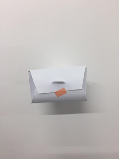
this net design is very sweet, the fold used on the box on the fastening creates a nice and personal unique touch. the net seems more like a present because of the way you open it rather than a standard food packaging box.
also the box is big enough for the panettone to be placed in, and easy enough to be taken out.
the ribbon can be hung from the shape used on the top of the box also (theres enough surface space for a hole to be created.)


net 02 -

net 02 was very easy to make, when more needs to be printed in production it won't be too time consuming. the box is round and delicate rather than a cube creating a more pleasing look. its also not like standard food packaging and instead creates a gift like design, making it more personal. 
the ribbon can be sewn through the tab at the top of the box, the packaging seems secure and is also the right size for panettone to be placed in.


net 03 -

this net reminds me of a box which you would receive from a Chinese takeaway. therefore doesn't reflect the idea of a christmas gift. the box is also very narrow and therefore a panettone wouldn't fit inside. 


net 04 -

this net reminds me of a shape which you would find around christmas time, the net would sit nicely when hung from the tree. the style of the net is modern and different. however panettone would not fit inside here as the top of the net becomes to narrow. 


discussion with Sophie -

together we have agreed on net 02. within the brief it states -

"The gift needs to be economically designed for a long run production of approximately 1500 copies."

- the net for this design is easily folded and was therefore not as time consuming so will relate to the expectations of the brief. nothing needs to be printed on this design also suggesting a more economical design.
- the net is secure and the food inside the box will be 100% covered.
- the tab at the top of the net allows a hole to be punched through and then the ribbon can easily be threaded through also.
- the sizing of this net has a big enough surface area for the panettone to be placed inside, its also a good height and will therefore not squash the panettone. 
- the rounded edges of this box creates a more delicate design, and the box is more gift like rather than a standard food packaging product.


Brief 08 | YCN Fedrigoni - Concept / development

concept -

the concept of the brief is to create food packaging using the Constellation range paper from Fedrigoni. The food to be packaged will be panettone, reasons for this food is because - its from Italy therefore relates to the brand of Fedrigoni and also is associated as a christmas treat. The panettone's will be mini and will fit nicely inside the christmas party bags. The packaging used for the treat will have a dual purpose. The first is to hold the food and the second is when the food has been eaten then the packaging can be used as a bauble to be hung as a christmas decoration around the house. Therefore the packaging needs to have a christmas design and sparkle!

current panettone packaging - 


- traditional and bold designs
- square box shapes
- ribbon secured around the top
- in the shape of a present
- fun and unique aesthetic
- christmas feel

box ideas -


1 - a cube shaped box, 'merry christmas' displayed on the front, this could be foiled in silver to present a more christmas aesthetic. hung at the top by decorative ribbon. this net is the right shape and size for the the panettone to be placed.

2 - A ginger house themed box. ginger bread is commonly associated with christmas, the paper would be digitally printed with the gingerbread themed design on. a small window on the front would be cut through and the panettone would then be seen. 

3 - a pyramid shaped box, one of the sides would also have a small window on the front which would be cut through and the panettone would then be seen. on another side of the box a christmas greeting would also be cut through and a red acetate stuck on the other side to act as a red window.

4 - a cube shaped box, with a christmas greeting laser cut out on the front side. then red acetate would be stuck over to act as a red window. hung by a red ribbon to keep the design uniformed. the white Constellation range paper would be used to give a more christmas design, and keep the design minimal and clean.  

discussion with Sophie -

we both like idea 4, the simple and minimalist design would best suit the brand, its also clean and would therefore reflect other adverts used across fedrigoni. the use of the window helps the consumer see the panettone and create a more unique look. the colours red and white will help create a festive look and the red window would be uniformed to the red ribbon that will be used when hung as a decoration. the words used on the box need to be unique and a remembered christmas saying, these words will also be laser cut to ensure a sharp, clean and consistent design. 
There needs to be more development into the range of boxes and each tested to see what would hold the panettone best. 


Wednesday, 15 March 2017

Brief 08 | YCN Fedrigoni - Ideas / Discussion

From the research about fedrigoni we found out that it originated from Italy, therefore if we could incorporate Italian elements of christmas with the gift it would make a solid response to this brief and also relevant to the brand.

mandatory requirements -

"To design a highly coveted Christmas gift using our Constellation range"

(a range of embossed textured paper types)

Constellation Snow: Uncoated white papers and boards, certified FSC, made with E.C.F pulp. High strength, one-sided off-machine embossed in 19 different patterns. Two-sided embossed in three patterns.

Constellation Jade: Woodfree papers and boards, certified FSC, made with E.C.F pulp. One side coated with a silver pearlescent finish. Thirteen patterns available.

Constellation Ivory:
Ivory uncoated papers and boards, certified FSC, made with E.C.F pulp, two sided embossed with three different patterns.

Idea 01


- create a range of christmas cards, maximum of 3 designs each on a different constellation stock. Apply print finishes such as emboss and foiling to create a christmas feel. Type only should be used on the cards and each have different Italian christmas greetings, this will relate to where Fedrigoni has originated, and makes it more personal to the brand as well as relevant. 

Idea 02

- design and make baubles from the constellation stock. be able to manipulate the paper to create fun and exciting baubles, apply pattern on the baubles to help them stand out against the tree. attach coloured ribbon into the bauble shapes which allows them to be hung on the tree or around the house at christmas time.


Idea 03

- create a food packaging product using the constellation stock. the food should be Italian and therefore relate to where fedrigoni has originated from. the food packaging could be a small box and then can ideally fit into the party bags at the christmas party.


discussion with Sophie

we both like idea 03. creating a food packaging for a christmas treat seems like the nicest sentimental gift that someone could give. however we need to be creative with the packaging and make it reflect christmas as well as be a sustainable piece of packaging.