Friday 24 February 2017

Brief 06 | Photography Collab - Brief / Discussion (Zeinab)

During the discussion last week Zeinab wanted a business card designing where it works with her prints. Therefore she suggested a business card that was wrapped up and something that felt more special.

After the discussion I emailed her some ideas that I thought would work well, I told her to have a read and decide if she liked any of the same ideas to see if we were on the same page.

Idea 01 - Business card 85mm by 53mm. The front of the card is a collage of your prints, with your name embossed on the front. Thick card and a texture on the front and back of the card.

Idea 02 - Business card 85mm by 53mm. The photo reels on the front like what was in your zines. Name foiled in a silver metallic foil. Minimal style font. Wrapped in tracing paper of one of your prints and secured with a sticker or strip of tape. (your initials printed on the front) 

Idea 03 - Business card 85mm by 53mm. Plain textured card, bold colour on one side of card. Your name foiled or embossed. And the card wrapped in tracing paper, secured by a patterned thread / string.

Reply - 

So I really like the idea of collaging or doing the contact sheets like my zine. I also love love the idea of foiling or embossing.
And having it wrapped in like tracing paper, kinda makes it feel like dainty and precious.

Since the reply from Zeinab I have stared to look into a range of business cards and how different approaches can work.
The deadline I have set myself for this is the end of march to be completed. 25th March

Brief 05 | Photography Collab - Final Zine & GIF

Final Zine Images -


GIF / I decided to make a GIF as an extension for this brief for Alex, this could be used on her website and promotional pages, it makes it interactive and will allow clients to see a finished publication of Alex's.

GIF -


Evaluation -

Designing and binding this zine for a photography student has being highly enjoyable. Coptic bind is a bind that I have never done before and by doing this collaboration it has now allowed me to pick up a new skill. The printing of this zine was also something new and a lot of concentration had to go into this to insure the zine was printed out correctly and suited the desired bind. A range of stocks were used within the design and therefore specific photographs had to be carefully selected to work on different stock types, for example coloured stock had to have black and white images. Working with Alex was good and would do it gain, she let me know exactly what she wanted and gave consecutive feedback in order for the zine to be developed towards production.

If the zine could be made again, I would reconsider the GSM of the white stock. This is because when binding the zine it has tore in some places where the thread has been pulled and become tightened. A 100+ GSM would have worked better and had a higher quality outcome.

The final distribution of this zine is to work in Alex’s portfolio and to show off to clients when she is looking for jobs. It works well as it shows off her work, and with the use of a unique bind and a range of stocks it creates a interesting appeal towards an audience, and stands out, something which a client would be looking for.

Brief 05 | Photography Collab - Printing & Binding experimentation


I first wanted to practice a range of binding methods to see which I preferred to do and to understand the bind that would be best suited to Alex's Zine.

Firstly I experimented with a saddle stitch, this is a bind I have done before and its very easy to do and is a quick process, it was also the most accurate out of the 3 because its very simple.


2 holes were punched 2cm from the top of the spine and the bottom. Then thread was stitched through and tied together in the middle of the book. 

I then experimented with a coptic bind, this is where the stitch is seen along the spine of the book. This had the most attractive appeal, however it was time consuming and quite fiddly, but works well as the pages lay flat once opened.


This is where 4 or more holes are punched through each booked, the thread is then passed through each of the holes in the different booklet and become intertwined together. The thread is then seen on the spine and creates a interesting and unique look. 

The last bind I experimented with was the Japanese bind, this was also very fiddly however the pattern from the thread that is left looks unique and creates an aesthetic appeal. 


This bind consisted of punching four holes through the book near the spine and lash it together with needle and thread. To make smaller books, fold several sheets of paper paper carefully into halves or quarters, clamp the stack together and punch and bind it.

Personally my favourite bind was the coptic bind, this is because it looked the best, the pages laid flat and it was the bind which I enjoyed making the most.
When discussing with Alex she agreed that the coptic bind was also her favourite and therefore we decided to go ahead with this design.

Printing -

Once me and Alex were happy with the layout of the Zine it was then ready to print. We used the printers in the University and were printed using laser printers -
'a printer linked to a computer producing good-quality printed material by using a laser to form a pattern of electrostatically charged dots on a light-sensitive drum, which attract toner (or dry ink powder). The toner is transferred to a piece of paper and fixed by a heating process.'

The printing all came out really well and the colours took well to the different stocks. Because we both opted for a coptic bind the zine had to be printed out in booklets so it would work better with the zine. Each booklet was then folded and was ready for binding.


Coptic Binding (Kettle Stitch)  -

"Coptic binding or Coptic sewing comprises methods of bookbinding employed by early Christians in Egypt, the Copts, and used from as early as the 2nd century AD to the 11th century. The term is also used to describe modern bindings sewn in the same style."

Coptic binding process -


Binding the Zine -


I opted for a neon pink thread, this was because I wanted it to contrast with the colour of the stock within the book and stand out on the spine of the zine. 
The process was very easy, however at some points the paper did rip where I pulled the thread to tight, this was because the paper is a 70 GSM and is therefore thin so this easily happened. 
The thread also kept running out whilst stitching the book so had to knot more thread on the end of the old, this made bits of the thread poke out and become un-neat.

Brief 05 | Photography Collab - Binding Research (Alex)

staple bind -


The staples pass through the folded crease from the outside and are clinched between the centermost pages. Two staples are commonly used but larger books may require more staples along the spine.

+ quick, easy, cheap, accurate, secure
- doesn't look great, common form of binding

coptic bind -


A non-adhesive form of binding that stems from bookbinding methods employed by ancient Egyptians! Signatures are sewn through their folds, and attached to one another and again sewn through two loose covered boards with a chain like stitch across the spine. 

+ looks aesthetically pleasing, stands out, unique, secure
- time consuming, no room for error.

 japanese bind -

using this decorative sewing technique is to only expose the stitching on the inside of the book. This is achieved by turning in the edge of the cover boards to create a hinge; the book is then sewn from the inside. It is recommended to use Japanese style binding for large or landscape format books as the binding requires a large margin.

+ unique and individual, looks really pleasing, secure
- time consuming, no room for error.

section stitch -


The most secure binding method. Here pages are folded together into sections (signatures). Each section is then sewn into the following section along the spine. The spine is then glued together for extra support and the cover then attached. A Section Sewn book, regardless of pagecount will be able to lay flat.

+ able to lay flat, very secure, pleasing to look at


metal clip bind -


The pages are folded and then hole punched in the central of the page. The metal clips are then passed through the holes and secured.

+ secure 'trendy' east to flick through pages cheap
- some may not find it very pleasing. personal taste.

Discussion with Alex - 


Brief 05 | Photography Collab - Final Development (Alex)

Using a 4 by 4 grid on indesign insured there was some uniformity within the photos, some photos used a similar layout however because a playful tone was needed some of the spreads didn't use the grid.


- gradients give the background a fun and playful aesthetic, the colours also contrast with the umbrella used in this image and gives it similarity.
- the use of Chinese type gives an intriguing and secretive design. 


- overlay of images, the colours reflect each other and therefore helps create a relationship between the two instead of being random / irrelevant.


- the leopard print border creates a fun element, it also reflects the textures in the image. 


- this image is full bleed because its a nice image, the pink stands out a lot in the background and the girl thats featured is the focal point of the image.
- the right hand side of this spread will be changed to a pink stock, this will then reflect the pink flowers in the photograph on the other page.


- pink stock used across the spread enables the black and white image to stand out more, it makes the book more playful.


- pink stock used on the right side again to contrast with the black and white photograph.
- the use of negative space creates a minimal and modern layout. 


- the overlay of image attracts attention, it also reflects the vice / urban / street photography which was aiming to come across throughout the zine.


- type used in the background - the word 'youth' is repeated and this is the main content throughout the zine. 
- each of the image reflect each other and the party scene.


- parallel images used within the grid, the blank space appreciates the photos more


- receptive imagery creates the vice / street design.
- makes the zine more interesting with different layouts


- alex wanted a range of stocks, this image will be on tracing paper, because the colours are bold this would work well on a transparent stock.


- the red background aligns to the red in the image.
- using yellow tape creates a scrap book style but also contrasts well with the red on the page. 


- the use of the smoke emoji reflect the content within this image.
- it creates a fun and playful aesthetic - a element that alex was keen on.


- similar to the previous image - the tape creates an idea of a scrap book.
- the same girl is on the image on both sides of the spread, this makes it more uniformed / relevant.


- the image is intriguing, by using the full bleed it makes it seems important. and this picture has a lot of content in. The colours all work really well with each other also.


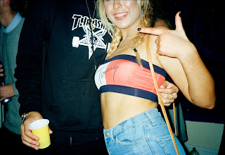
- the girl in the photo is wearing a tommy Hilfiger top, using his signature in the background of this spread gives it a sense of identity and also reflect the idea of street wear thats featured throughout the zine. 


- layered image of a girl waiting at the train station. the image is used twice as it makes it more pleasing and interesting but then also fits in with other layouts featured in this zine.


- the camo print background links to the camo trousers, this is one of the main focal points within this photograph.


- tape used on the back page to let the audience know the photographer, the use of the tape fits in with the themes and styles within the zine, and also a DIY feel. 

Feedback from Alex -

"Heyaaa! I love ittt! There's some changes we could make but only small parts , wooo so happy. I have some more ideas for text and noted down some paper types from the gf smith website! Will you be in on Monday?"

To do next -

- meet up with alex to discuss the final outcome
- book a print slot
- order GF smith stock
- finalise zine
- research binding process
- print!
- bind

Meet up with Alex went really well, she has started a work file full of fonts and text which she is wanting in the book. She also wants a few things changing and is going to send over photos that she wants to include more of.


Brief 05 | Photography Collab - Development (test prints)

Test prints were printed digitally to see if the images worked with the chosen paper stocks which Alex has asked for. The main stock was a white matt 90 gsm this was to give a more magazine feel to the publication. The images worked really well, it was a concern that its very thin and you would be able to see through the paper, however this was not an issue, and instead it worked well.


Another issue was that Alex wanted to use a range of stocks in her book, however I was concerned about how well different coloured stocks would take the ink and didn't want it to ruin the images. So I asked Alex if she would send me black and white images 


The white 90 gsm stock folded really well and was very thin so when approaching the binding of the zine it shouldn't be very difficult with a needle and thread. The pages also sat very flat, this then meant the full image could be seen and didn't effect the images it also won't be difficult when  doing something as simple as turning the page etc..


Brief 05 | Photography Collab - Feedback (Alex)

I sent Alex some of my favourite spreads that I designed and asked her for some feedback to see if I was on the same page as what she's looking for.


Feedback from Alex -

"Girl that looks fabby I love it!!"
"The third is my favourite"
"I think with different coloured paper it'll break up the difference in colours in the pictures"


At the moment the zine is 23 pages long, which will cost a lot in the print room, I asked Alex what her budget is -

"I think 20 pages max! (20 page double sided) need to watch the budget!"

Crit feedback

We had a crit feedback session on the 9th of March, I wanted some feedback from this zine to see if the design worked with what Alex was after.

The crit was very useful and it got mentioned to look at Tracy Ma's work, which I have done and has given inspiration on how to develop with the publication.

The bind which I was opting for was a open bound optic bind, one person from the crit group has done this bind before and was said that the bind wouldn't work with the amount of pages, the stock also needs to be thick. This is something I will have to discuss with Alex and see what other binds she likes.

The designs are looking ok, but if anything I'm been to safe. and should experiment a bit more with the weird and trendy tacky designs.

Next -

keep developing Alex's zine, I have a print slot on Wednesday morning so will print some of the pages I have done for a test print. Think of a different binding method. Meet up with Alex sometime this week to finalise photos and the designs.


Brief 05 | Photography Collab - Development (Alex)

"So as we spoke about having a playful aesthetic with the images as well as the format, this is what I went for when selecting the first lot!"


- overlay of image creates a more interesting layout, linking by colours to make the page seem more uniformed.
- keeping a surrounding negative space create a more modern design, coloured paper could be used to give a more fun layout. 


- taking textures from the images and creating the border gives it a intriguing and fun aesthetic
- catches the eye
- makes the image and layout link 


- In this photograph the main colours that stood out were white from the window and the pink umbrella,then using these colours as a gradient background catches attention and creates a fresh look.
- later on I included a border around the image again of gradient, this gives more shape and creates more interest on the page.

pattern experiment - 


The pattern didn't suit the urban theme and was overly playful for the context. However to make it suit the images more I decided to use type to portray a relevant pattern.


using the word youth reflects the images used throughout the zine, and making it repetitive creates a pattern that seems to be more fitting and relevant to the concept of this publication.


Brief 05 | Photography Collab - Photos (Alex)

Alex sent me over some of her photos - these are the first batch and hoping to receive the second sometime in the next week. A meeting is needed with Alex to see if the layout and aesthetic is what she is wanting, we also need to discuss type and what text it is that she's wanting across the spreads etc.