Thursday 27 April 2017

Brief 11 | Oh' Aura - Development

Stock -

The stock which will best suited to the earring packaging must support the earring therefore it has to be strong and can't rip when hung from an jewellery fixture. The stock also must have a high GSM to avoid it ripping when the holes from the earrings are pierced into the card. Colourful stock will also be used to ensure the prints stand out and contrast well which will make them stand out around the shop floor. The most suitable GSM for this stock is over 200GSM to ensure it will work with the earrings and with them being hung.

Colour Palettes -

When researching the earrings bold colours such as yellow, pink, blue and oranges have been used, therefore this is an important element to keep the theme of bright colours, it allows the design to be consistent as well as vibrant. The ideas demonstrate how different colours can be used to compliment and contrast well with one another. The theme will be pastel colours and bright card. 

I then took the sketches and began to create patterns on illustrator ready for screen printing later in the week -

In the initial ideas the favourite shapes were suns, moons, cactus' and flamingos. These shapes also represented the earrings and would make the brief as a whole consistent as well as reflect the brand idea. 

I created a repeat pattern of the chosen shapes, therefore when screen printing I can print it onto bigger pieces of paper and then cut it down more accurately later. The black was added so the shapes would expose well during the screen printing process. 


Wednesday 26 April 2017

Brief 11 | Oh' Aura - Ideas

Packaging /

Experimenting with a range of shapes to understand the possible of outcomes would work best;
Triangle, circle, square, rectangle, oval etc
From the research informed it was decided that a rectangular shape would suit the packaging best and there was a few reasons for this:
- Balance
- more surface area for pattern
- accessable
- easy
- simple

Patterns & Colours -


very quickly sketching shapes and testing with colours lead to the idea of repeating a pattern that reflected oh auras earrings such as sun shapes and moon etc.
The colours that worked well together were pastel backgrounds with bold colour used on the shapes.
This idea made oh aura more recognisable as a whole and kept the fun brand image alive. 

When gaining feedback regarding this idea it was said 

"i like it, it represents oh' aura instantly and the bold colours will make it stand out from the crowd. it will look unique and fun!'


Brief 11 | Oh' Aura - Research 02

Earring packaging -

Analysing a range of earring packing and how they are presented to customers in shop will give a good understanding as well as direction when designing the basics, also giving ideas of what elements should be included within the design.


This is slightly different to earring packaging I have seen before, however seems personal and slightly luxury is a small delicate paper bag. It is then secured with a sticker which shows the logo of the brand. These would be ideal for a gift, however theres no where to hang them in a shop and the customer would be unable to see them.


This packaging has been created carefully and allows the customer to stand them once they get home perhaps on a table or dressing table. This way they won't get lost and will keep them safe as well as secure. The logo has been used at the bottom of this packaging giving them identity. In a shop they could be used like this along the till or placed on display tables around the shop floor. 


The packing for these cloud earrings is sweet. The placements of where to pierce the earrings has been considered carefully and is used on the side with the bold colour which will help increase the earring to stand out amongst customers. The logo is used on the opposite side which ties in nicely with the rest of the design and keeps it subtle. 


A large hole has been cut through the packaging of these earrings to make it easier when hanging them on display in a shop. The corners have also been cut to create a more decorative piece of packaging. The earrings are placed in the centre making the customer to be drawn to these rather than a design. 


Lastly this packaging is more fun than the others as it uses type and illustration. The cactus earrings are placed in the middle of the card with the quote 'life is like a cactus full of pricks but also beautiful.' humour is used on the card which will entice customers to pick it up and read. The colour of the earrings contrasts well with the card allowing them to stand out. However no hole has been used for the earrings therefore can used on a stand so similar to above they would have to be placed in appropriate places around the shop floor.

Analysing the range of packing for earrings currently on the market has given direction in elements that I should be include such as grabbing attention, and also how the packaging can work within a shop and be placed around the shop floor. Its also given an insight of how pattern / colour / text can be used on the card to help entice audiences and stand out within a shop. 

Brief 11 | Oh' Aura - Research 01

Oh' Aura

First part of the research is to look in to Oh' Aura understanding the brand and the earring styles which they make and sell.

Instagram Page -


Earrings - 

The earrings come in a range of fun shapes and use bold and bright colour. This makes them playful and stand out to a wide range of audiences. Very girly shapes and colours help appeal to there target market.

They are made by 1 girl making them very personal. She has drawn each shape individually and then laser cut them into wood, this helps create sharp edges giving them a good quality. 


Brief 11 | Oh' Aura - Brief

Brief -

Oh’Aura is an online page selling earrings. However the brand is now going to be a concession within a department store. Oh’Aura have asked you to design some earring packaging. The earrings come in all different styles, visit their Instagram page to get an idea of what they sell. The design must be relevant to the company and stand out against the competitors.

Background / Considerations -

The earnings will be hung from a fixture so consider the layout of the packaging. Also the design must reflect the company and the earrings, think about the print techniques to get bold and colourful pallets. Also the size of the hearing packaging it needs to fit on a stand with other earrings so think how you can fit the design on and earring holes. The name must be features on the packaging alongside there online shop for promotion.

Mandatory Requirements -

Your work should be documented through regular labelled posts to your Design Practice Blog.

In addition to the submission requirements for the briefs you will need to evidence research development and production of your resolutions.

Your response to the brief should be supported by a rationale and evaluation of your work in relation to the initial brief.

Deliverables - 

Resolutions & Products appropriate to your selected brief. A maximum of 8 design boards, articulating the selected research, development, resolution and contextualisation of your work.

Posts to your Design Practice blog demonstrating your ability to effectively record, document and critically evaluate the progress of your work in relation to your own intentions and appropriate areas of contemporary creative practice.

PLAN

26th April - Brief & Plan
27th - 29th April - Research
May 1st - Ideas
May 2nd - Ideas / Development 
May 3rd - Development
May 8th - Printing
May 11th - Finishing off
May 12th - Photos
May 13th - FINISHED

Brief 10 | Research Brief - Final Posters

01 -


02 -


Brief 10 | Research Brief - Social Media

FACEBOOK


The Facebook page for the brief is very straight forward and simple to follow. The profile picture would change weekly indicating the biggest news story of the week. Also on the right hand side of the profile picture there are 4 other news stories which show current news. This will all change weekly and update keeping the audience connected. The posters that can be seen on the streets and around public transport will be posted weekly onto this Facebook page with a short description of whats happening. Its important that everything is kept short and staight to the point in order to keep the target market engaged. 

Brief 10 | Research Brief - Distribution & Questionnaire 02

News story 02 -

Trump drops mother of all bombs on Afghanistan. The bomb was non nuclear and had never been used before. The area where the bomb was dropped is mostly mountainous and sparsely populated, BBC correspondents say. Local sources said the explosion was so powerful it was heard in two neighbouring districts.

The aim for poster 02 was to inform the younger audience what Trump has been up to most recently; This was that he dropped one of the biggest non nuclear bombs on Afghanistan and finished it with the words 'another job well done.' The aim of this poster was to portray how careless trump is and also show the audience what he's capable of. Therefore the illustration of trump shows him in a childish manner, the image in the background is the real of image of the bomb which was dropped in April. The yellow text is used to stand out in the foreground of the image and coordinate with other colours used within the poster. 


To test this poster to see if it educates easily I asked 5 18 -24 year olds what they think the poster is aiming to achieve -

Results -

What do you think the poster is aiming to do? Is it effective?

"It almost makes a mockery of him because of the illustration, and shows the raw power of what he has done and what he is capable of. Shows he's having a good time destroying things and doesn't really care."

"Its funny, makes him look silly. It tells me that he's done another stupid thing without even thinking twice"

"Its a poster that would make me look twice, not the typical kind of news poster you would see in the street and thats what I like about it because it stands out."

"Shows just how destructive trump can be so in that way its powerful. But uses image to make it more fun and slightly light hearted. Think this is something that needs to be done to engage more young people on the news around the world."

"I think its trying to tell us what trump has done, the images make it easier and clearer to understand also more enticing than just a normal news article. It makes me want to know more about it."

Brief 10 | Research Brief - Distribution & Questionnaire 01

I wanted to distribute the posters in places which would be obvious to the intended target market, therefore thought about bus stops  and public transport as this is one of the most common ways young people travel. I also thought about other means of transport such as the tube and placing the poster on the underground. 

News story 01 - 

Following the news regarding the June the 8th elections, educate 18 -24 year olds one of the political parties promises if they get the vote.

For this poster to educate I chose the labour party and found some of their pledges from their website which I think was deemed most appropriate for this age group and ones that would most effect their future. Using a cut and paste technique from magazines and newspapers to make a poster which portrayed a fun and bold aesthetic helping to engage the intended audience. The man was a illustration found in a magazine and felt it best represented Jeremy Corybn a red tie was stuck on to help represent the Labour party. There has been emojis also used on the poster to help appeal to the audience and a rounded type face to give it a playful aesthetic The use of the poster being illustrative will help entice 18 -24 year olds as its different and less boring than a bulky piece of text or photographs. 

To test this poster to see if it educates easily I asked 5 18 -24 year olds what they think the poster is aiming to achieve -


Also I thought distributing this poster around universities and colleges, for example notice boards are placed all around university and they will get seen everyday, so this seemed appropriate and is direct to the target age group. 


Results -

"Its very different to a typical flyer or something you would get in the post, its fun and relatable to young people, the use of type and emojis is more sort of bubbly would catch my eye and appeal to me. I think the stories about Corybn giving to the people."

"Its playful and fun, would make me look twice because its not like a typical news poster. I can tell its Jeremy Corybn because if the illustration and the red tie also gives it away. The colours look nice together and are eye catching."

"it looks quite childish, but in a good way, its kind of like news for dummies! the images work nice and the colours makes it seem a more friendlier approach than a newspaper"

"its cute! the illustrations make it look more appropriate for our age group, and the information can be soaked. I think its good to have the text on the top as it just makes it more obvious as to what it is about."

"its fun, clearly shows Corybn telling the people what he wants to change for the June the 8th election. The emojis are a clever way to appeal to the audience which your trying to, makes it recognisable and a more fun element."


Brief 10 | Research Brief - Development

Because poster 01 is slightly illustrative and uses bold colours this was a element which I had to incorporate within the second poster to ensure that they are consistent and run alongside each other. Because the first poster is now done, its important to use the same type and layout styles to insure they work and could be recognised week after week.

The second news story was one that happened mid April when Trump dropped a non nuclear bomb on Afghanistan, the bomb was described as mother of all bombs. The explosion was so powerful it was heard in neighbouring districts. Trump describe it as - 'another job well done.'


This illustration is by Chris Piascik he is a illustrator that does a range of fun and colourful work representing every day life. Some of his work is political such as this trump drawing. I thought its quite humours and presents him in a childish way, which will go along with the chosen quote which was in the article that I read. 


By placing the illustration on the top of this explosion it represents the mess he has created and shows there is only him responsible. The image of the explosion is from the daily mail and is the real image of the bomb that was dropped over Afghanistan in April, this also makes the poster more reliable and accurate. The image is slightly pixilated, however it works well with the illustration and represents the collage effect which I was initially going for. 
When getting feedback in the development of the poster it was said that - 'theres humour, and shows what trump is capable of as well as making him look childish and irresponsible.'


Using the type from poster 01 - it was initially cut from a magazine, I then photoshopped out the background of the type and changed the colours to see which was more suited to the poster. By using the same type it helps to ensure that the posters can work together and if their was a poster every week it begins to make it more recognisable to the audience. 


I felt the yellow worked better than the purple / blue and tied the colours together with his hair, it looked more smart. However it was suggested a darker yellow to be used to make the type stand out and work better with the posters overall look. 


Again like the other poster a small amount of text is used at the bottom of the poster, which taken from a headline and helps to sum up the image. The yellow type becomes more uniformed with the rest of the colour used on the poster and creates a more straight to the point look which was found in the research. The audience also get the chance to find out more if they wish on the designated Facebook and Instagram pages. 


Feedback for this poster was positive -

"the humour used with the image of trump would grab my attention makes you look twice'
'I like the pixilated image of the explosion, it creates a more diy look and suits the look of the poster'
'it portrays trump in a silly way, its clear what the poster is informing me too, and he's done another reckless thing.'


Brief 10 | Research Brief - Development

Development 01 was a fail and the posters didn't look great nor interstate the message which I was aiming for. Instead I decided to go back and choose brighter bolder imagery in order for the posters to stand out and catch the audiences eye.

Instead of just sticking to newspapers I now decided to go to arty magazines and find pattern, illustrations and bold colours to make the posters more exciting towards the intended target market.

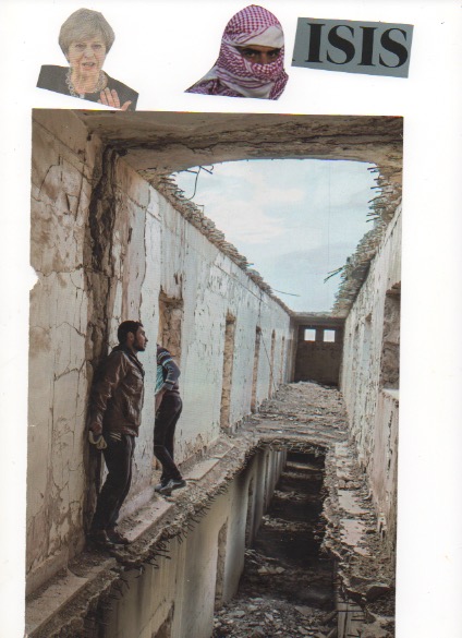
First finding this image of a white bearded man which had a slight representation of Jeremy Corybn I cut a make shift tie from some red paper and this made him represent the labour party. The man in the illustrations happens to be stood behind a presentation table which worked well as it looks as if he's on question time for example.


I then chose 3 pledges from the Labour website which I feel would suit the target audience the most and currently effect them in the future the most. Then cutting pastle type with contrasting colours from the magazines to give a cut and paste / DIY look. 


In order to make the type more visually stronger and exciting I began to use similar images. For example the emoji used in the picture below represents strong and this would be used alongside education. This is a pledge used on labours website and therefore suits and becomes effective. Also emojis are most used and recognised by children to young adults making it fit the target market for this brief. The pad locks also seen in the image below coordinates with the pledge that is secure homes, using more imagery fits the brief more and also more visually inciting. 


The crowd which is used at the bottom of the poster is by a illustrator called Jana Glatt she uses bright bold colours to make her work stand out, and is usually seen across children's book. The crowd in this image looks like a group of protesters and fits with the idea of the poster that they are there to support Jeremy Corybn. 


Once deciding on imagery to use beside the type i then began to repeat it and place it evenly to fall into the crowds. This shows equality and also that these policies are for everyone of Corybn wins the vote. Love hearts are used to exaggerate the love for the NHS and make sure it stays as it is. The padlocks represent the safeness of UK homes, and the maths symbols reflect strong and safe education. 


Then adding text which reads - 

8th June - Remember to Vote!
Find out more about the labour pledges on Facebook and Instagram

By added this small amount of text it helps to avoid any confusion and does inform the audience what the poster is about. To extend this brief I want to make social media pages alongside the posters too as I feel like this is currently the most successful way to communicate to the intended audience because of the research that was found.

The font used for this was called Fredoka, this font was proffered because of how playful it is. The round fonts ensures its easy to read and suits the purpose of the poster - to easily inform. First choosing the colour red ensured that it stood out from the background.


When asking for feedback it seemed there was a lot of room for improvement and how it could be better so be more visually appealing.
Firstly instead of the type being placed diagonal it was suggested to list it and it could then be better seen and read. 


Also the crowd used at the bottom of the poster introduces too many colours and should be kept as the same colour palette or a block colour. 
The type in the image below used a blue outline to make it stand out more on the background, however it didn't quite suit and began to look slightly blurred. 


The image of the crowd had too many colours going on and therefore it was suggested in feedback to make it one colour, similar to the rest of the poster. So chose a peachy / pink to coordinate with the tape used on the back of the text. 


However when asking another person for feedback it was said that the poster looks too feminine and maybe more red should be used in the poster to give it a more gender neutral appeal.


Editing the parts of the image to red made the poster more consistent and work better as a whole. Also by removing the background of the letters the pledges were more legible to read and went with the aesthetic of the poster without it seeming to over the top. 


Tuesday 25 April 2017

Brief 10 | Research Brief - Ideas /Development

When developing the stories into poster formats I used national geographic magazine and papers such as the daily mail and the guardian. I began to take headlines and images which were suitable for the chosen story lines.
For the trump themed posters I collected images such as bombs, missiles and ISIS related imagery, and for the 8th of June images that represent Britain and leaders deemed most appropriate.  


Starting with the story of the 8th of June votes I decided to base this poster on the labour policies and therefore educating the younger generation of pledges which they are willing to put into place if they get the vote. 

"labours aim is to rebuild and transform Britain, for the many not the few. these 10 pledges set out the framework for what labour will campaign for - and what a labour government will do."

There pledges included -

- Full time employment
- A secure homes guarantee
- security at work
- a secure NHS and social care
- national education service
- action to secure our environment 
- put the public back into or economy
- cut equality in income and wealth
- action to secure an equal society 
- peace and justice at the heart of the foreign policy

To begin I tried to transform these pledges into images such as these seen below. The clock face and brief case helps represent full time employment and the lock and home reflects secure homes. 


I then began to collage them together, including more such as the world and plaster representing saving the environment. 


however once they were all placed together is became quite difficult visually to understand what the poster is trying to represent. There needed something to be put in place to make the message more clear.


Therefore decided to get rid of a few pledges and include Jeremy Corbyn in the poster to make it slightly more clearer to the audience -


Using a thought bubble helped to make it clear this is what Corbyn is aiming to achieve if he gets the vote, also by including a website it allows the audience to find more out if they wish about the pledges that labour are putting forward. 

However I really didn't like this, I thought it looked amateur and didn't represent what I wanted. The design is very simple and childish, I was aiming to capture the audience and I felt as if this wasn't doing so. 

Feedback which I received from this was that its difficult to understand because the images are small it was unclear what the poster was aiming to achieve. 

I decided to go back after this and collect more images from newspapers to make a poster which would be more successful. More colours and clearer images needed to be used to make the poster stand out and also create a message. 


Friday 21 April 2017

Brief 10 | Research Brief - Research 04

Amsterdam / Russian Revolution & Film

Recently on a trip to Amsterdam there was an exhibition which really captivated me. It was called Russian Revolution & Film and was by an artist called Kazimir Malevich. The exhibition was full of collaged political propaganda posters inspired by film posters along legendary films and Suprematist paintings.

The Russian Civil war (1918 - 1921) was followed by a revolution in Russian film art. Over 100 hundred foreign films were released each year, in addition to domestic productions made by Eisenstein, Vertov, Pudovkin, and others. Approximately three hundred million cinema tickets were sold annually. Lenin astutely recognised the effect of new media such as radio and film, and considered mass communication to be the means for shaping s new, technologically and politically conscious individual. Films the medium of the future and was used for propaganda purposes as well as entertainment, as long as the latter did not entail the dissemination of Western capitalist values.


The nature and message of a film determined the appearance of its poster. Designers of film posters were typically less strict in their application of consecutive montage techniques, which they combined with stylised but recognisable depictions in order to capture a film's atmosphere. The new Soviet world manifested itself in these posters through recurring modern visual elements such as aircraft, cars and camera, but also in the visual montage of human limbs and machine parts.