Friday, 5 May 2017

Brief 12 | Friendly Picnic - Ideas

Initial Ideas


When approaching the initial ideas, it became very important to consider how the packaging would work with the product. Because all the cutlery and plates are very different in size, it was difficult trying to get a concept where it would come as 1 product. 

The first idea was to box the knives, forks and spoons separate, then secure them with string, and the plates would come separate and would also be tied together with string and a label placed on the top of the plate stack and on the bottom. 

Second idea was to box everything together. The front of the box would have a window displaying the cutlery and the plates would slide in the box, however although this makes the product compact it would be a very bulky box, and when getting picking items it has to fit in a bag and be carried. Also the box would use plastic and therefore doesn't represent the environmentally friendly factor.

Third idea was to use a paper bag, the bag would be tied with string to keep the cutlery together, and the plates like idea one would be tied together with string. However because the cutlery would be exposed this could potentially put people off the product as their exposed and could cause germ contamination. 

Lastly was to use a clear plastic bag to keep the cutlery in and then secured with a sticker presenting all the information. Also the same idea for the plates. However like idea 02 this uses plastic and goes against the idea of environmentally friendly packaging. 

The strongest idea is idea 01. It goes with what the brief is asking which is to create environmentally friendly packaging, no plastic is used and the paper / card can be recycled along with the product after use. It also ensures the cutlery is kept safe in the boxes which will help the audience feel reassured when using them as they have not been exposed or touched. 
The plates will be tied together with string and a label on the front and the bottom of the product to give the information needed.


Brief 12 | Friendly Picnic - Research 02

Cutlery Packaging

Analysing a range of current cutlery packaging taught a lot of things which need to be taken into consideration when designing nets and developing ideas.

1


- paper bags
- tied with string (personal & unique)
- cutlery exposed could be seen as unhygienic
- 1 set of cutlery to 1 bag

2


- boxed set
- kept together with elastic band
- plastic window is deemed as not very environmental friendly
- sturdy box makes sure that nothing becomes broken 
- easy shape to store

3


- boxed set
- box can be reused and recycled 
- fun design makes in enticing 
- possibly screen printed? greener packaging?
- sturdy box makes sure that nothing becomes broken 
- easy shape to store

3 is the favourited the use of screen printed design stands out the most. also the box doesn't allow the cutlery to become damaged, it keeps it hygienic unlike 1 and also can be stored away easily. 

Screen Printing? Why?

Screen printing seems most appropriate for this brief, this is because it allows the colours to become bold and vibrant. Also is seen as environmentally friendly as uses no energy compared to printers. Finally could use vegetable inks making the product as a whole more sustainable.


Thursday, 4 May 2017

Brief 12 | Friendly Picnic - Research 01

Research 01

I wanted to analyse whats available on the market today and therefore researched into current brands that I know of that try to give back to the environment through the use of sustainable packaging,

Graze box


- boxes are made from 100% sustainable rain forest
- can be recycled after use
- inform there customers what could be done with the box after use e.g use the snack sections as herb punnet's
- their skewers are made from bamboo
- infromation leaflets are also made from 100% sustainable forests


- boxes are made from 100% recycled plastics
- bottles and cartons can be recycled after use
- paper labels are made from recycled papers
- inform their customers what they can make with the products once finished for example veg pots can be made into pots for plants and herbs etc. 

analysing what both of these brands do t create a greener product has educated me on all the sustainable resources which can be accessed, also encouraging the clients to reuse the products after use, even if its for planting plants and herbs etc. It shows their products have a number of uses!

Wednesday, 3 May 2017

Brief 12 | Friendly Picnic - Brief

Brief (1 week)

Marks & Spencer are launching a new recyclable picnic range for the upcoming summer of 2017 and are in need of some environmentally friendly packaging to go alongside their new product. The range is called ‘Friendly Picnic’ and contains 4x folks 4x knives 4x tea spoons (all wooden) & 4x palm plates, all of which can be recycled and disposed of after use, the cutlery is yellow which fits with the summer feel. The cost is £3.99 per pack so the design does not need to be luxurious, just straight to the point and effective.

Background / Considerations -

Its important to consider the audience; this product will be an add on item or a last minute purchase for the target market, so it needs to be easy to read and all information presented clear. The packaging needs to be environmentally friendly too, so think how to print the packaging and also the materials that will be used. The cutlery is yellow, so this may need incorporating with the design and not too much colour should be used.

Mandatory Requirements -

Your work should be documented through regular labelled posts to your Design Practice Blog.

In addition to the submission requirements for the briefs you will need to evidence research development and production of your resolutions.

Your response to the brief should be supported by a rationale and evaluation of your work in relation to the initial brief.

Deliverables -

Resolutions & Products appropriate to your selected brief. A maximum of 8 design boards, articulating the selected research, development, resolution and contextualisation of your work.

Posts to your Design Practice blog demonstrating your ability to effectively record, document and critically evaluate the progress of your work in relation to your own intentions and appropriate areas of contemporary creative practice.

Thursday 4th - Research / Clean a screen
Friday 5th - Ideas
Saturday 6th - Ideas
Sunday 7th - Development
Monday 8th - Screen print
Tuesday 9th - Development
Thursday 11th - Photograph  

Tuesday, 2 May 2017

Brief 11 | Oh' Aura - Final


Lastly it seemed appropriate to create a poster. The earrings are now been sold in store, so therefore designed a poster informing customers that Oh'Aura is now available to purchase in store. Using the images of the earrings allows the target market to gain instant recognition. The font was kept the same of the stickers which allowed a uniformed design. Yellow type was used on the poster so the information would stand out, and a pink box used to match the colours of the earrings and also allowed the yellow to stand out more. 


Brief 11 | Oh' Aura - Stickers

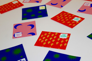
The backs for the earrings feature no information about the brand and details. Instead in the initial ideas I suggested to produce some stickers which would be displayed on the front of the packaging. Because a lot of colours are used within the earrings and now the prints I experimented with a range of colours that could be used together to ensure they stand out and go with the theme.

The fonts used for the stickers are Plakkat and Apercu. Using Plakkat is bold because of its thick brush stroke and encourages the type to stand out, paring this with bright colours will encourage an enticing design. Apercu is used also because of it minimal style and therefore wont distract the detail from the Plakkat font, its also legible and therefore will be used to display the social media links. The colour palette will consist of pastel stocks, which will pair with the bold ink used in the screen printing making the patterns vibrant and stand out.


Because there are a range of different sets of earrings different packaging designs would seem most appropriate. Therefore no 2 colours of the patterns would be the same. All the colours used above represented Oh'Aura whether this was through the earrings or the prints created for the packaging, therefore all the colours above got printed, this then allowed there to be a mix and match on the packets, making it more fun and unique. 

Unfortunately there was no print slots available at the university to print these stickers, and therefore ordered them from MOO which is an online store. When the stickers arrived they were square with a shiny finish which worked well with the shape and style of the packaging. 


Brief 11 | Oh' Aura - Development

Screen Printing

Card & colours -

pink flamingos on mint green card
green cactus on orange card
yellow suns on cobalt blue card
blue moons on pastel pink cards

Screen printing was deemed the best process to print the cards, this is because the colours are so much more vibrant and bolder; this was a design which I was aiming to achieve. Screen printing the earring backs ensures they will have a more personal feel, this is also important because the earrings are made by one girl so creates a unique product all together.


From the initial ideas it was clear that a square / rectangular shape would be better suited for the earrings, this insures a number of things such as it will balance better when hung, it gives enough space for the earrings to be pieced through the card and insures enough of the designs can be seen. 


All the prints worked really well. However there are 2 outcomes which I wasn't overall pleased with. The first was the blue moons on the pink card, when printing it came to my attention that the screen had a few small holes in, therefore this appeared on the final card. During the process of printing I attached tape on the screen to seal the holes over, but this worked in some places better than others.
Secondly the yellow suns that were printed on the blue card can't be seen as well as the should, I tried to add some neon yellow ink to the mix to try and make it more vibrant however it didn't do a lot.